Beauty&Design Lab
- Design learning workshop space, stools and displays: Krill o.r.c.a.
- Design team: Harmen van de Wal with Chiara Tobia
- Concept learning environment: Kim Cornelius and the Zadkine Beauty & Design team
- Concept B&D City: Harmen van de Wal with Igor Runsink, Kim Cornelius
- Client: Zadkine Beauty&Fashion College
- Project Management: Niels van Oosterbosch (KWK Huisvestingsregisseurs)
- Project Management Zadkine Beauty & Design Lab: Ria van Oosterhout
- Contractor: Hofrijn Bouwgroep
- Technical laboration curtains: Carla van Beurden, Rotterdam
- Manufacturer curtains: Tulay, Rotterdam
- Fabric design curtains: Onno Raadersma
- Carpenter cupboard: Bende, Rotterdam
- Circular light fixture: Solid Lighting, Rotterdam
- Manufacturer cardboard stools and displays: Kartent, Amsterdam
- Floor: IVC flooring
- Tables and chairs (re-use): Gispen
- Area: 90m2
- Start design: June 2022
- Realization: March 2023
- animation: Studio Can
- Photographer: Frank Hanswijk
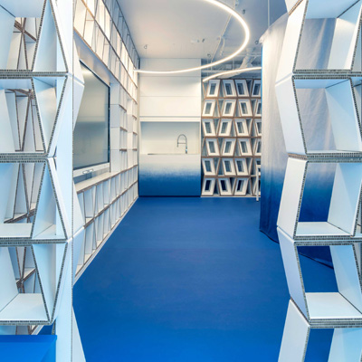
Located at the Karel Doormanstraat, a shopping street in the heart of Rotterdam, a former covid test site was repurposed as innovative learning environment for blended learning. Mixing physical and online education has been taken as central theme in this design. The space derives its color from the bluescreen; a cobalt blue floor continues with a gradient on the walls. When curtains are closed, entirely blue spaces are formed in which customers can be scanned for virtual avatars to enable digital fitting of cloths, jewelry and make up and to digitally try out different hair styles.
In the Beauty & Design Lab, the newest trends and developments in the beauty and fashion branche are placed in the center of attention, along with sustainability and inclusivity. Zadkine, a large vocational school aims to make students from the very beginning feel at ease with the diversity they will encounter in their professional career.
The Beauty & Design Lab team wanted a space where multiple activities could be performed, ranging from fashion shows and master classes to desk research, total make over treatments and 3d scanning. In the small space at hand, this could never take place simultaneously. Krill-o.r.c.a therefore chose to have a flexible subdivision using curtains as room dividers.
The education concept was intertwined in the development process. In the process of defining program of demands and the look and feel of the space, Zadkine students were given the role of client. Tutors pitched their ideas with them, which Krill-o.r.c.a. then translated. Harmen van de Wal and Chiara Tobia, the designers of the space, advised the students in this process. “We were happily surprised by the engagement and professional attitude of the students. They were sincerely concerned for the mental well being of future clients, had clear ideas on the use of colors and were well able to guide us through the different, often contradictory demands. On the one hand, for example, there was a demand for a blue screen space for digital recordings, on the other hand they wanted calm colors to avoid overstimulation of the clients. Thus was the base for the use of the gradient”.
In the design, Krill-o.r.c.a used bio based, re-purposed and circular products. Since it was not clear how long the space would be used, the floor to ceiling displays were entirely designed as cardboard displays instead of using the ubiquitous plywood or block board. Natural (but impressively blue) felt was used for curtains, while the pvc flooring was produced circularly. Where possible, the products were made by local manufacturers and suppliers. The gradient on the walls were applied by local graffiti artists, a wooden cupboard, the curtains and light fixtures were made by makers in the upcoming M4H district in Rotterdam, the cardboard displays by the young, Amsterdam based innovators of Kartent.
